Rihga Royal Laguna Guam
Creating the most flavorful hospitality experience in Guam
Branding
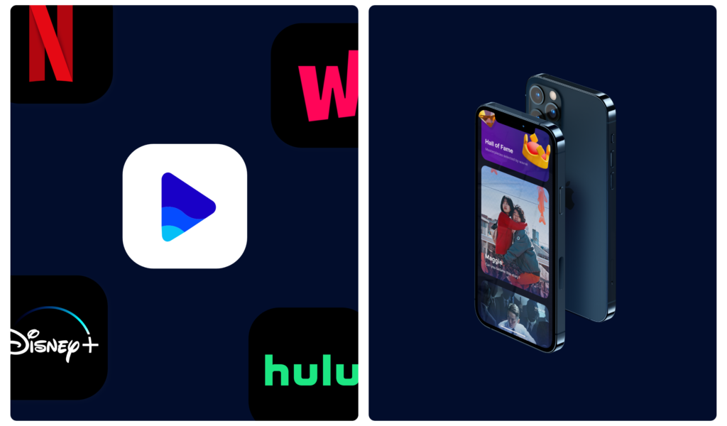
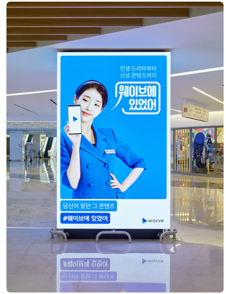
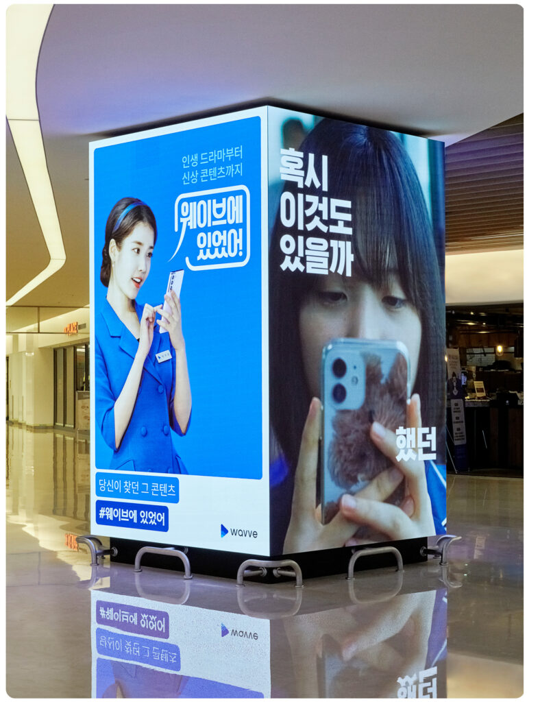
Establishing a new brand image and system for an OTT service
Project Goal
wavve’s existing content had different styles of graphics every season without established design system overarching coherent tone and mood. BAT consolidated brand assets and images wavve had built and developed graphic motif to apply to overall brand play and ad campaigns for the coming years.
As a final output, a design guide was delivered not only for in-house designers but also for marketers and external partners to use developed motif flexibly.
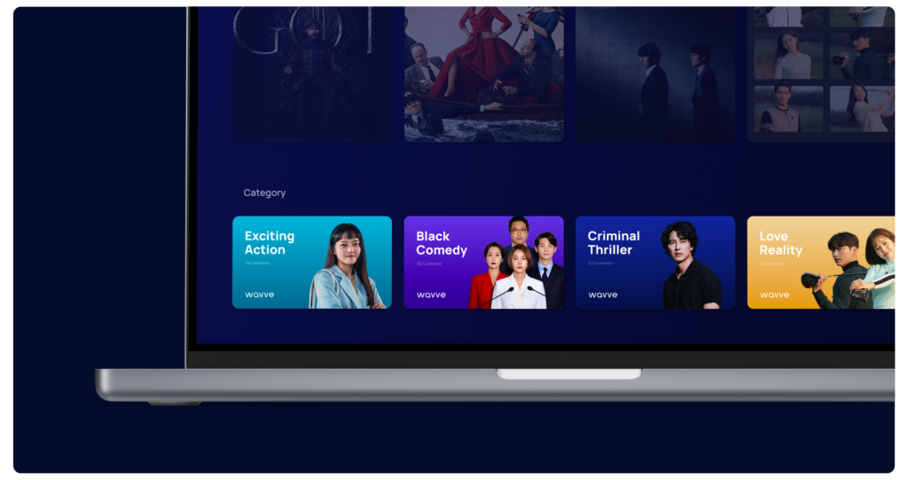
Graphic Motif & System
wavve brand name intuitively brings up the image of ‘wave.’ Being simple yet easy and powerful, ‘wave’ became the main source for the graphic motif. Instead of creating new visual graphics, we focused on expressing the moving characteristics of wave rather than the shape of it.
The result was three different types of wave: Smashing, Swelling, and Seeping. Afterwards, these three types were developed further into layering system and graphic moduler that could flexibly respond to diverse media channels.
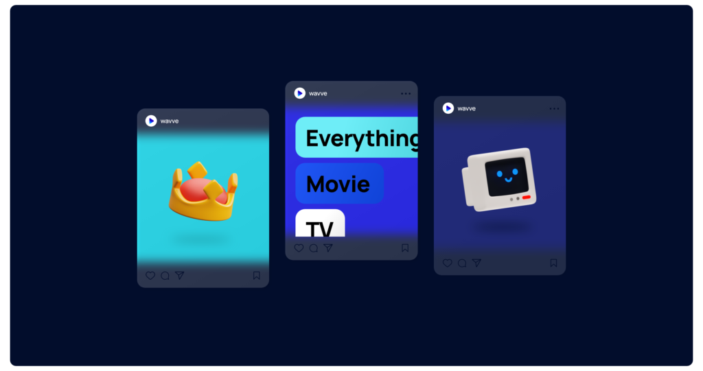
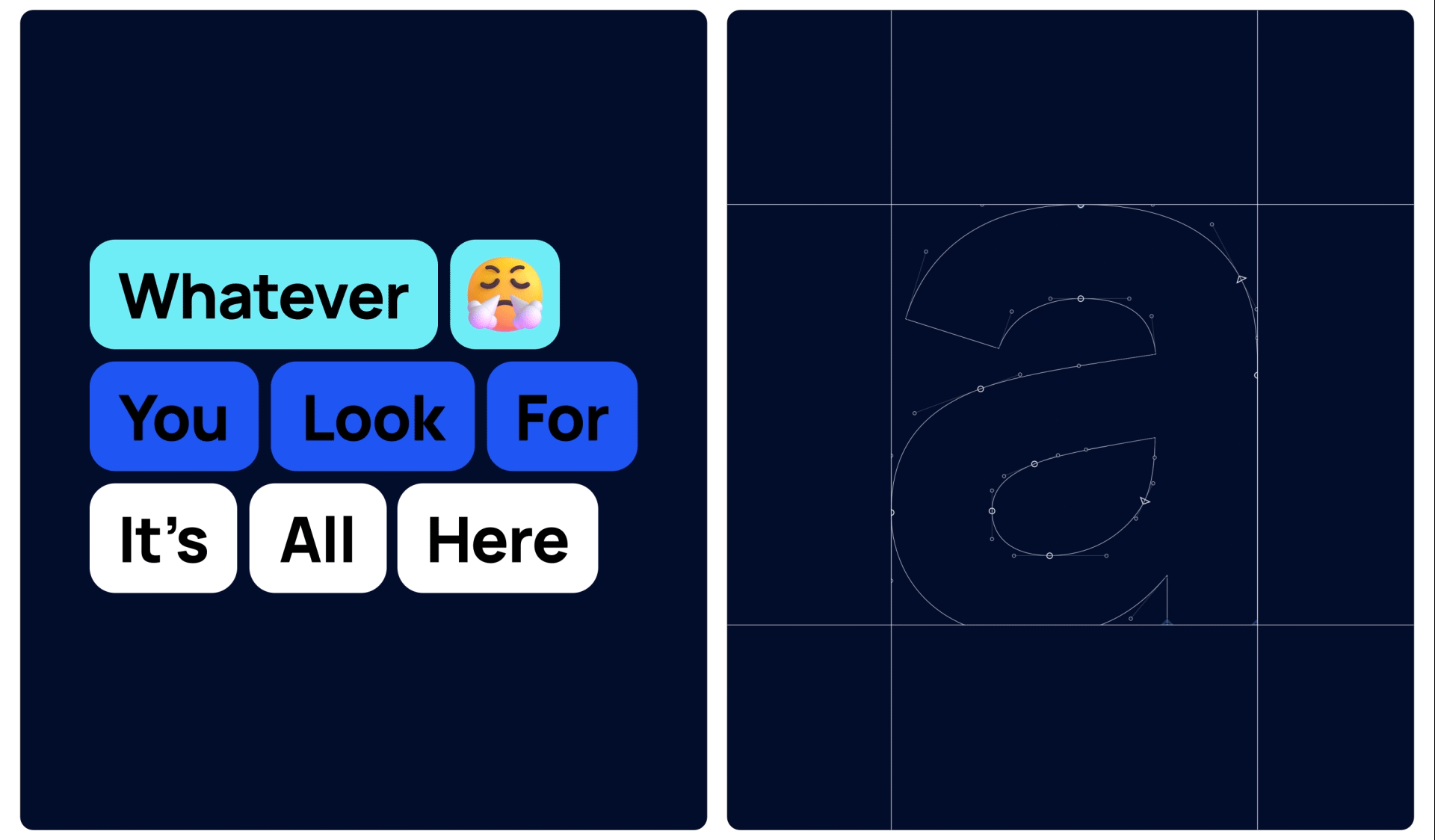
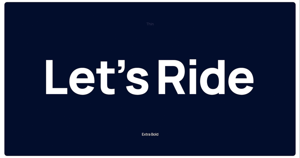
Typography & Iconography
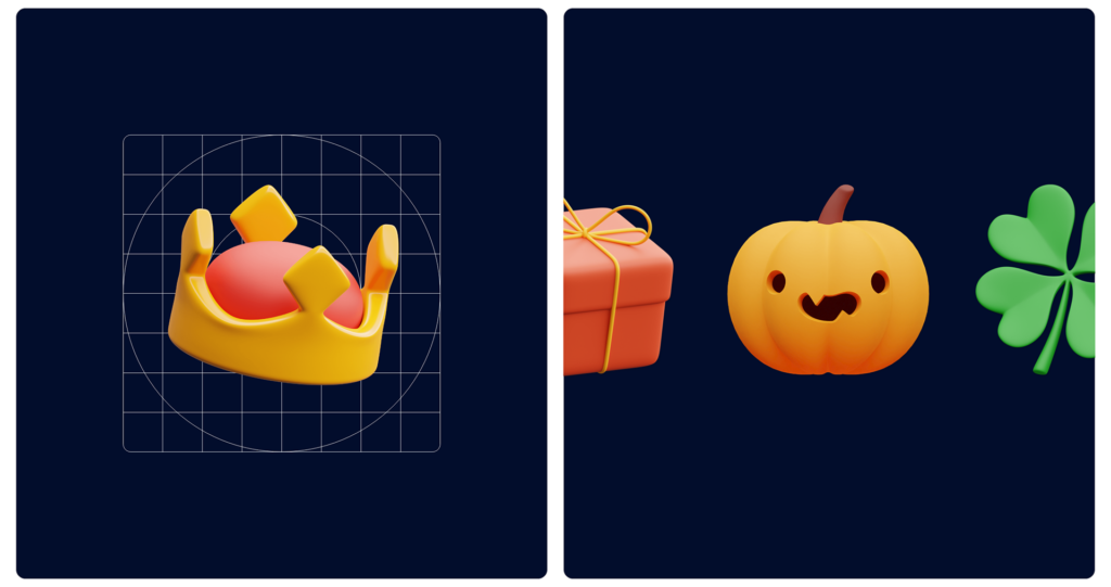
In choosing the brand typeface, usability was considered most importantly as wavve service was prominently provided under digital environment. We carefully chose a type family that adapts to diverse environments from small device screen such as digital watch to big billboard screen. As an additional tool to assist friendly communication, a set of 3D icons that goes well with each content genre was added to the system.
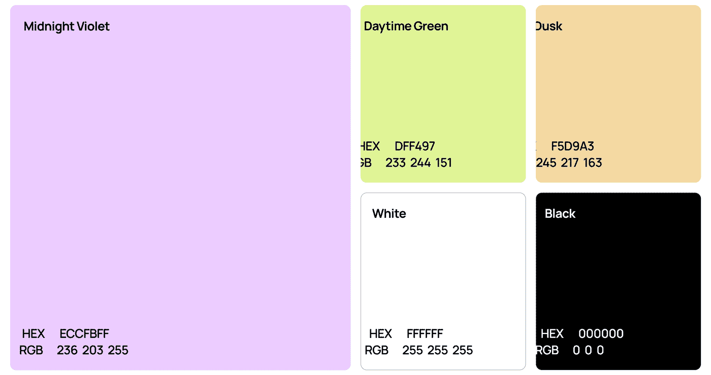
Brand Color
We meticulously adjusted existing primary brand color blue and added shades to respond to multiple screens including dark mode. Newly added secondary colors, inspired by colors from daytime to midnight, reflect various genres and wavve service enjoyable all day long.
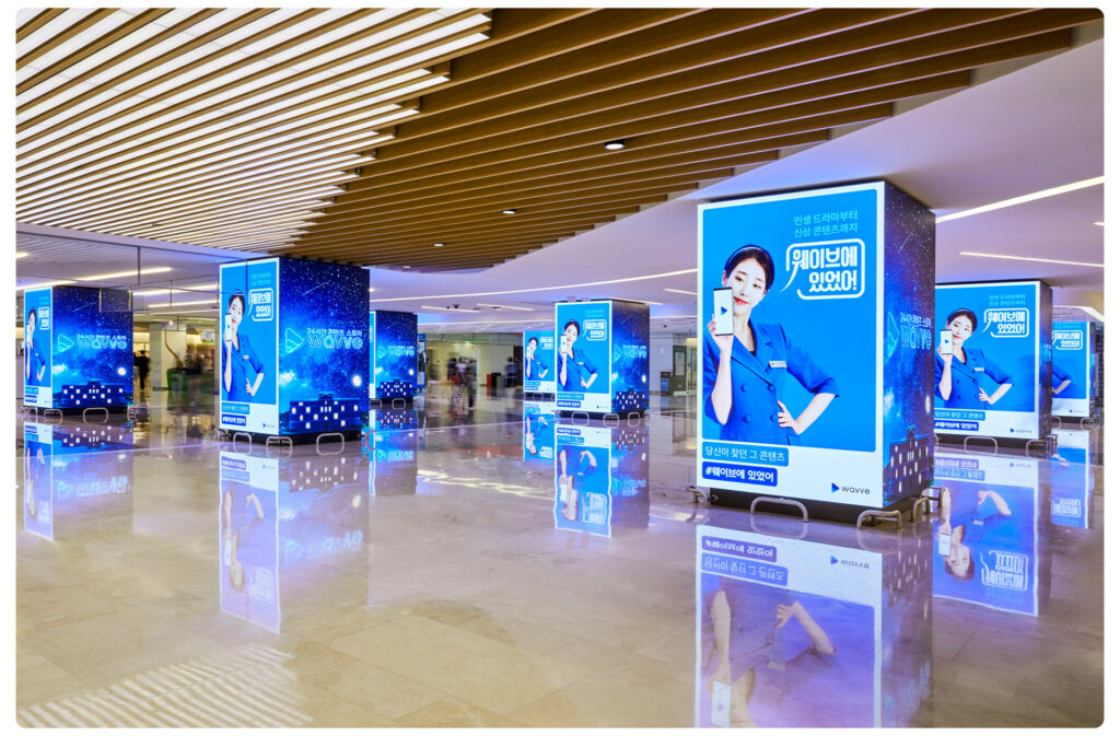
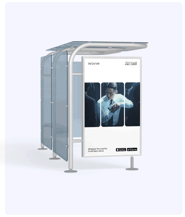
Extended Application
Applications are designed under consolidated new graphic motif and design principles to deliver consistent brand identity. This way, we expect to raise brand awareness and differentiate our brand image from other competitors in this industry.

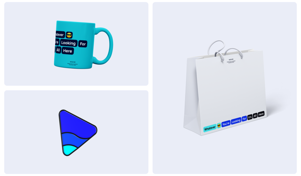
wavve brand goods are designed using consistent brand colors and brand slogan to reinforce brand identity and wavve’s mission to the members.
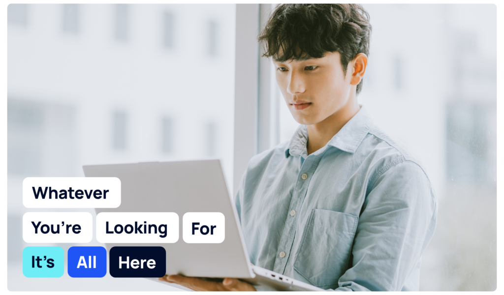
On digital device, deep blue color is used as a background color to minimize optic fatigue and brand colors are used as a point color to increase legibility and the level of attention.